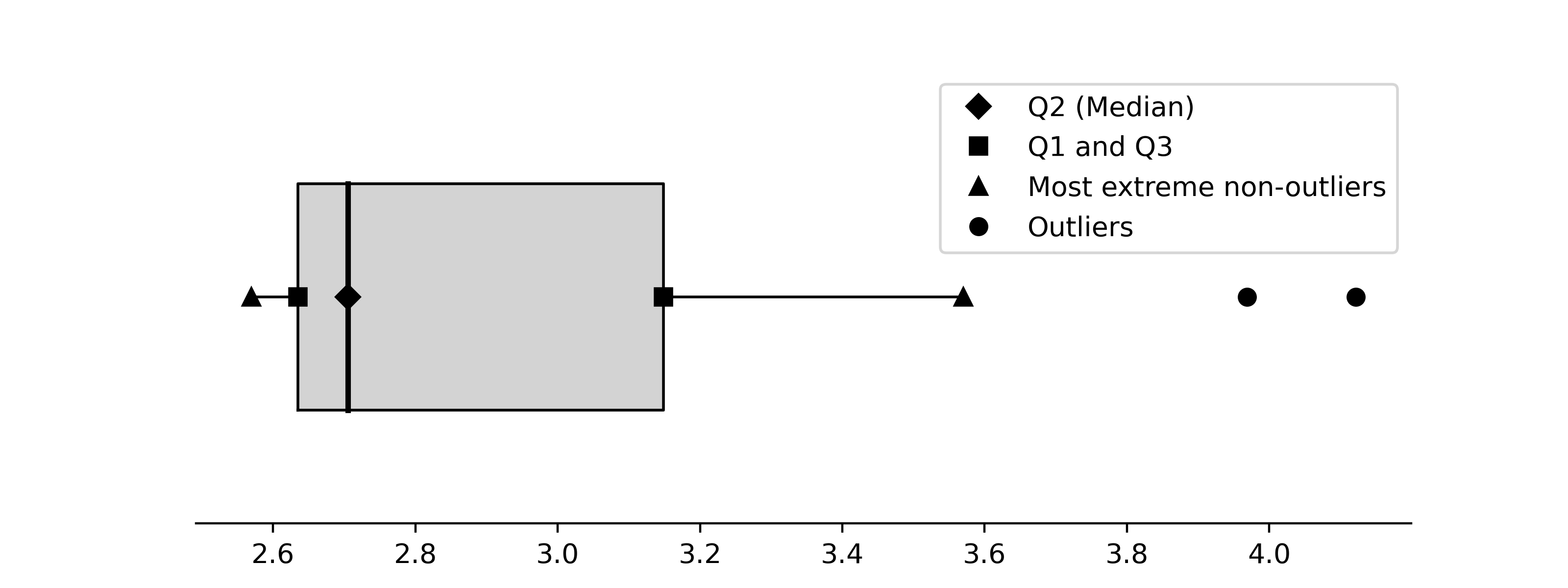
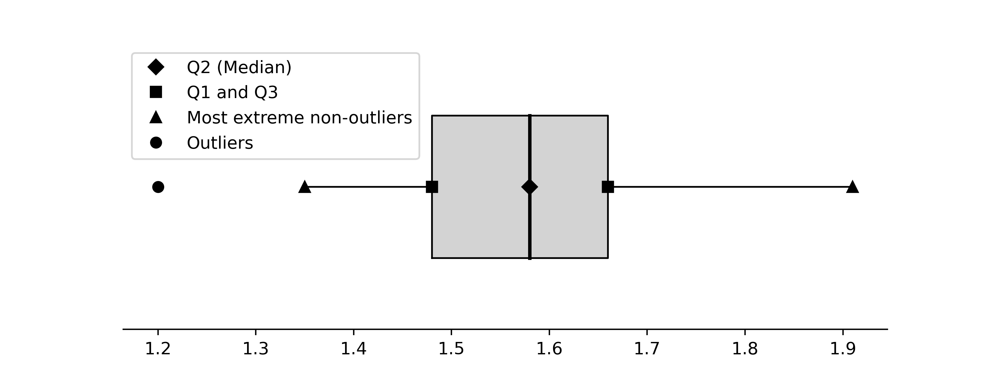
20  Boxplots

Author

Karl Gregory

Another plot that has established itself as an “essential worker” in visualizing the distribution of the values in a random sample is the boxplot. This rather curiously defined plot is intended to convey the location, spread, skewness, and heavy-tailedness of a distribution.

Given a set of values \(X_1,\dots,X_n\) with ordered values denoted by \(X_{(1)} \leq \dots \leq X_{(n)}\), one creates a boxplot as follows:

  1. Define the first, second, and third sample quartiles as \(Q_1 = X_{(\lceil 0.25n \rceil)}\), \(Q_2 = X_{(\lceil 0.50n \rceil)}\), and \(Q_3 = X_{(\lceil 0.75n \rceil)}\), respectively. These are the \(0.25\), \(0.50\), and \(0.75\) quantiles, respectively, of the distribution placing probability \(1/n\) on each of the values \(X_1,\dots,X_n\). So \(Q_1\) and \(Q_3\) are the \(25\text{th}\) and \(75\text{th}\) percentiles and \(Q_2\) is the \(50\text{th}\) percentile or the median of the distribution of \(X_1,\dots,X_n\).
  2. Compute the interquartile range (IQR) as \(Q_3 - Q_1\). This is a measure of spread.
  3. Mark the positions of \(Q_1\), \(Q_2\), and \(Q_3\) on number line; then draw a box extending from \(Q_1\) to \(Q_3\).
  4. Identify points as outliers if they are greater than \(Q_3\) or less than \(Q_1\) by an amount exceeding \(1.5\times \text{IQR}\).
  5. Draw a “whisker” extending from \(Q_3\) to the greatest non-outlying value and another extending from \(Q_1\) to the least non-outlying value.
  6. Mark the positions of the outliers.

One can give the boxplot a horizontal or a vertical orientation. Here are some examples:

Example 20.1 (Pinewood derby finishing times) Here is a boxplot of the pinewood derby finishing times from Example 15.1.

Code
import numpy as np
import matplotlib.pyplot as plt

plt.rcParams["figure.facecolor"] = "none"
plt.rcParams["axes.facecolor"] = "none"
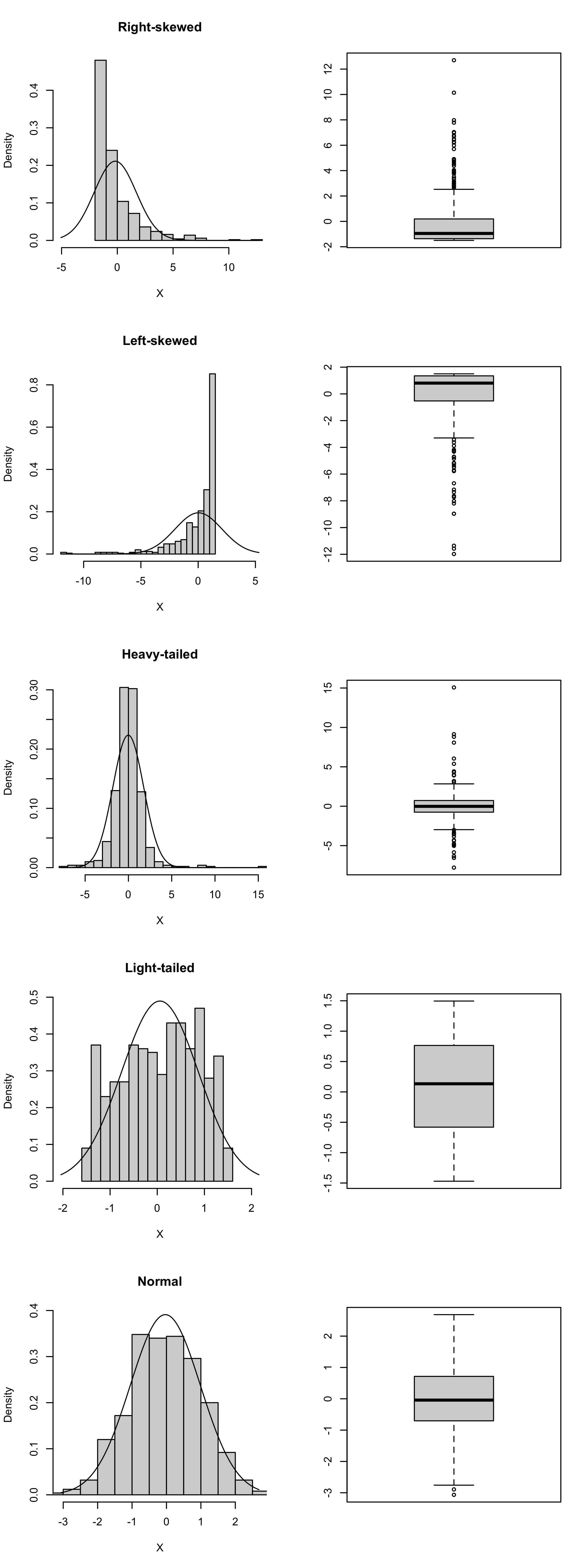
def boxplot(x):
  
  x = np.sort(x)
  n = x.size
  Q1 = x[int(0.25*n)]
  Q2 = x[int(0.50*n)]
  Q3 = x[int(0.75*n)]
  IQR = Q3 - Q1
  
  nol = (x < Q3 + 1.5*IQR) * (x > Q1 - 1.5*IQR)
  
  wlo = min(x[nol])
  wup = max(x[nol])
  
  fig, ax = plt.subplots(figsize = (8,3))
  ol = x[nol==False]
  
  ax.plot([Q2],[0],'D',color='black',label='Q2 (Median)')
  ax.plot([Q1,Q3],[0,0],'s',color='black',label='Q1 and Q3')
  ax.plot([wlo,wup],[0,0],'^',color='black',label='Most extreme non-outliers')
  ax.plot(ol,np.zeros(ol.size),'o',color='black',label='Outliers')
  ax.fill([Q1,Q1,Q3,Q3],[-1,1,1,-1],color='lightgray')
  ax.plot([Q1,Q1,Q3,Q3,Q1],[-1,1,1,-1,-1],linewidth=1,color='black')
  ax.plot([Q2,Q2],[-1,1], linewidth=2, color='black')
  ax.plot([Q3,wup],[0,0], linewidth=1, color = 'black')
  ax.plot([wlo,Q1],[0,0], linewidth=1, color = 'black')
  
  ax.get_yaxis().set_visible(False)
  ax.spines['right'].set_visible(False)
  ax.spines['top'].set_visible(False)
  ax.spines['left'].set_visible(False)
  ax.set_ylim((-2,2))
  
  ax.legend()
  
  plt.show()


ft = np.array([2.5692,2.5936,2.6190,2.6320,2.6345,
               2.6602,2.6708,2.6804,2.6850,2.7049,
               2.7111,2.8034,2.8300,3.0639,3.1489,
               3.2411,3.5701,3.9686,4.1220])
             
boxplot(ft)  

The boxplot shows that the third quartile is much further above the median than the first quartile is below the median. This is an indication of right-skewness. We see in addition that two outliers are flagged.

Example 20.2 (Boxplot of golden ratio data) Here is a boxplot of the ratios \(B/A\) from the golden ratio data in Example 15.2.

Code
gr = np.array([1.66, 1.61, 1.62, 1.69, 1.58, 1.43, 1.66, 
               1.69, 1.58, 1.20, 1.52, 1.60, 1.55, 1.67, 
               1.77, 1.50, 1.64, 1.54, 1.40, 1.36, 1.50, 
               1.40, 1.35, 1.48, 1.64, 1.91, 1.70])
             
boxplot(gr)  

The distribution of the golden ratio sample appears to be fairly symmetric; the median lies near the midpoint between the first and third quartiles.

Figure 20.1 shows boxplots for simulated random samples with \(n=500\) from right-skewed, left-skewed, heavy-tailed, light-tailed, and normal distributions. The boxplots are in the style generated by default in R.

Code
set.seed(3)
n <- 500

settings <- c("Right-skewed",
              "Left-skewed",
              "Heavy-tailed",
              "Light-tailed",
              "Normal")

XX <- matrix(0,n,length(settings))

# right skewed
a <- 1/2
b <- 3
XX[,1] <- rgamma(n,shape = a, scale = b) - a*b

# left skewed
a <- 1/2
b <- 3
XX[,2] <- a*b - rgamma(n,shape = a, scale = b)

# heavy-tailed
XX[,3] <- rt(n,2.5)

# light-tailed
XX[,4] <- (rbeta(n,1.25,1.25)-1/2)*3

# normal
XX[,5] <- rnorm(n)

par(mfrow = c(length(settings),2))

for(i in 1:length(settings)){
  
  X <- XX[,i]
  xbar <- mean(X)
  
  sn <- sd(X)
  lo <- min(X,qnorm(0.005,xbar,sn))
  up <- max(X,qnorm(0.995,xbar,sn))
  x <- seq(lo,up,length=500)
  fx <- dnorm(x,xbar,sn)
  
  h <- hist(X,plot=FALSE,breaks=20)
  
  plot(h, 
       main=settings[i],
       freq=FALSE,
       ylim = c(0,max(h$density,fx)),
       xlim = c(lo,up))
  
  lines(fx~x)
  
  boxplot(X)

  
}
Figure 20.1: Example boxplots for distributions of several shapes.