Now is a good time to introduce a couple of plots which are often used to visualize the distribution of the values in a random sample, in particular when the sample consists of continuous random variables. By “distribution”, we can think of the probability distribution which puts probability \(1/n\) on each of the values \(X_1,\dots,X_n\) in a random sample. The histogram is a tool for describing the shape of this distribution. By describing the “shape” of a distribution, we mean we would like to get from the data an idea of what the probability density function (PDF) of the population distribution looks like.
Recalling the pinewood derby finishing times of Example 15.1, we have already seen one visualization of the distribution of the values in the sample. This was in Figure 16.1, which depicts the probability mass function (PMF) that assigns probability \(1/n\) to each value \(X_1,\dots,X_n\) in the sample. This visualization is helpful to an extent, but if we have a large data set, such a plot will become so crowded with points that one cannot get a clear idea from it about the shape of the distribution. A plot called a histogram provides an estimate of the probability density function (PDF) belonging to the population distribution. The histogram is a function constructed from the values \(X_1,\dots,X_n\) by i) partitioning the range of the sample values into several intervals and ii) computing the proportion of sample values lying in each interval. Here is a technical definition:
Definition 17.1 (Histogram) Given a random sample \(X_1,\dots,X_n\) and a grid of points \(x_0 < x_1 < \dots < x_K\), where \(x_0 = \min_{1 \leq i \leq n} X_i\) and \(x_K = \max_{1\leq i \leq n} X_i\), define the intervals \(I_k = [x_{k-1},x_k)\) for \(k=1,\dots,K-1\) and \(I_K = [x_{K-1},x_K]\). Then the histogram based on \(I_1,\dots,I_K\) is the function given by \[
\hat h_n(x) = \frac{1}{n}\sum_{i=1}^n \mathbb{I}( X_i \in I_k)
\] for \(x \in I_k\), and \(\hat h_n(x) = 0\) for \(x\notin [x_0,x_K]\).
In the above the function \(\mathbb{I}(\cdot)\) is the indicator function, which returns the value \(1\) if its argument is logically true and 0 if its argument is false.
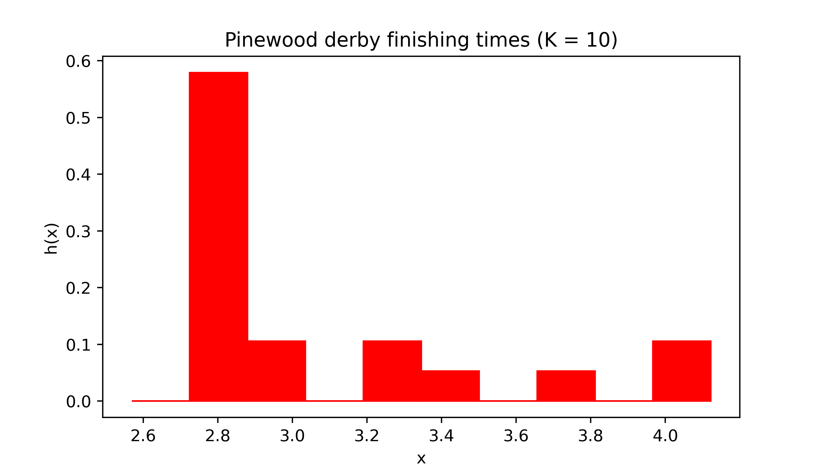
The grid of points \(x_0 < x_1 < \dots < x_K\) are usually equally spaced, and one can play with the choice of the number \(K\) of intervals into which to partition the range of \(X_1,\dots,X_n\). The code below defines a Python function for plotting a histogram and runs the function on the pinewood derby finishing times.
Code
import numpy as npimport matplotlib.pyplot as pltplt.rcParams['figure.dpi'] =128plt.rcParams['savefig.dpi'] =128plt.rcParams['figure.figsize'] = (4, 2)def myhist(X,K,col,title): x = np.linspace(np.min(X),np.max(X),K+1) h = np.zeros(K)for k inrange(1,K): h[k] = np.mean( (X >= x[k-1])*(X < x[k])) h[K-1] = np.mean( (X >= x[K-1])*(X <= x[K])) fig, ax = plt.subplots(figsize=(7,4)) ax.set_xlabel('x') ax.set_ylabel('h(x)') ax.set_title(title)for k inrange(K): ax.fill([x[k],x[k],x[k+1],x[k+1]],[0,h[k],h[k],0],color=col) plt.show()# pinewood derby dataX = np.array([2.5692,2.5936,2.6190,2.6320,2.6345,2.6602,2.6708,2.6804,2.6850,2.7049,2.7111,2.8034,2.8300,3.0639,3.1489,3.2411,3.5701,3.9686,4.1220])K =10col ='red'myhist(X,K,col,title='Pinewood derby finishing times (K = 10)')
Figure 17.1: Histogram of pinewood derby finishing times with number of equal-width intervals \(K = 10\).
One important thing to note about the histogram is that it is itself a PDF. That is, it never takes negative values and the total area under it is equal to one (so the total area of all the shaded regions in Figure 17.1 is equal to one). In fact, the histogram can be considered as an estimator of the unknown PDF \(f\) of the population distribution.
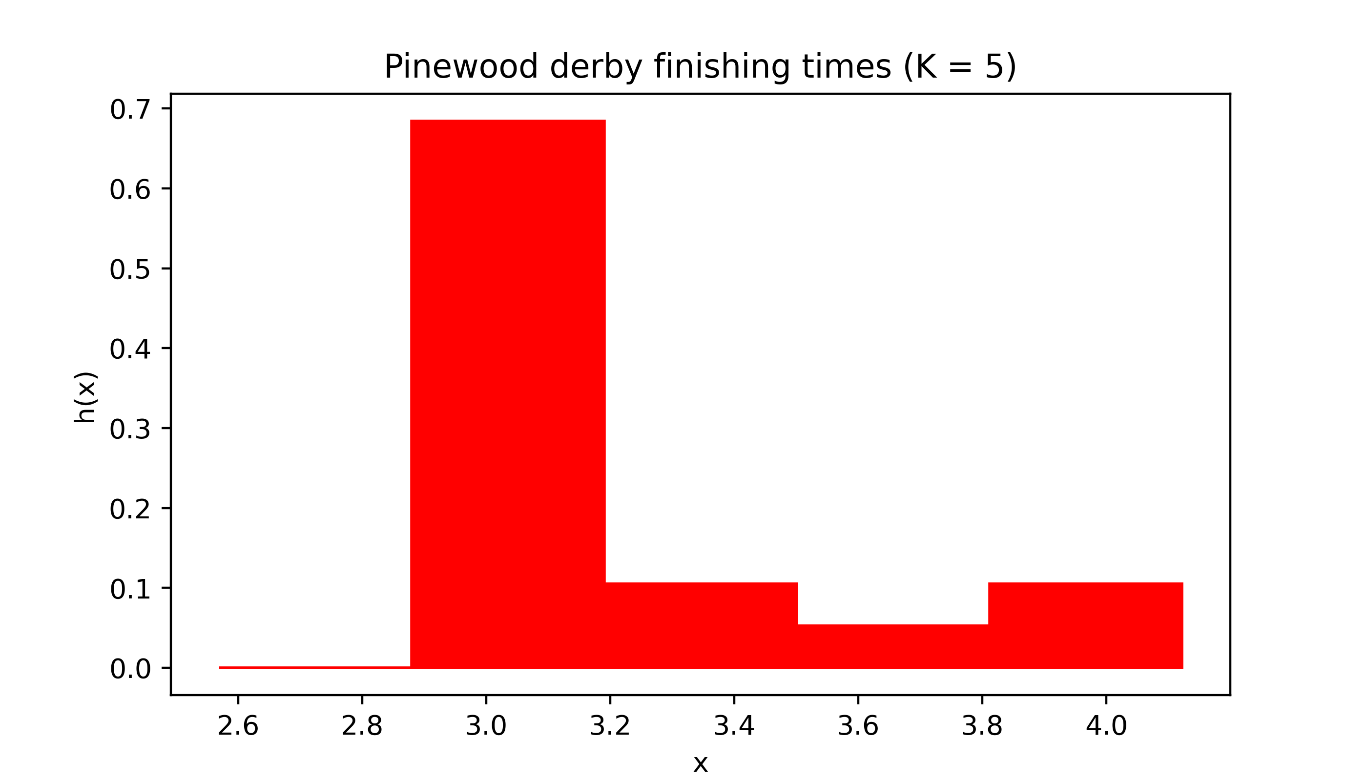
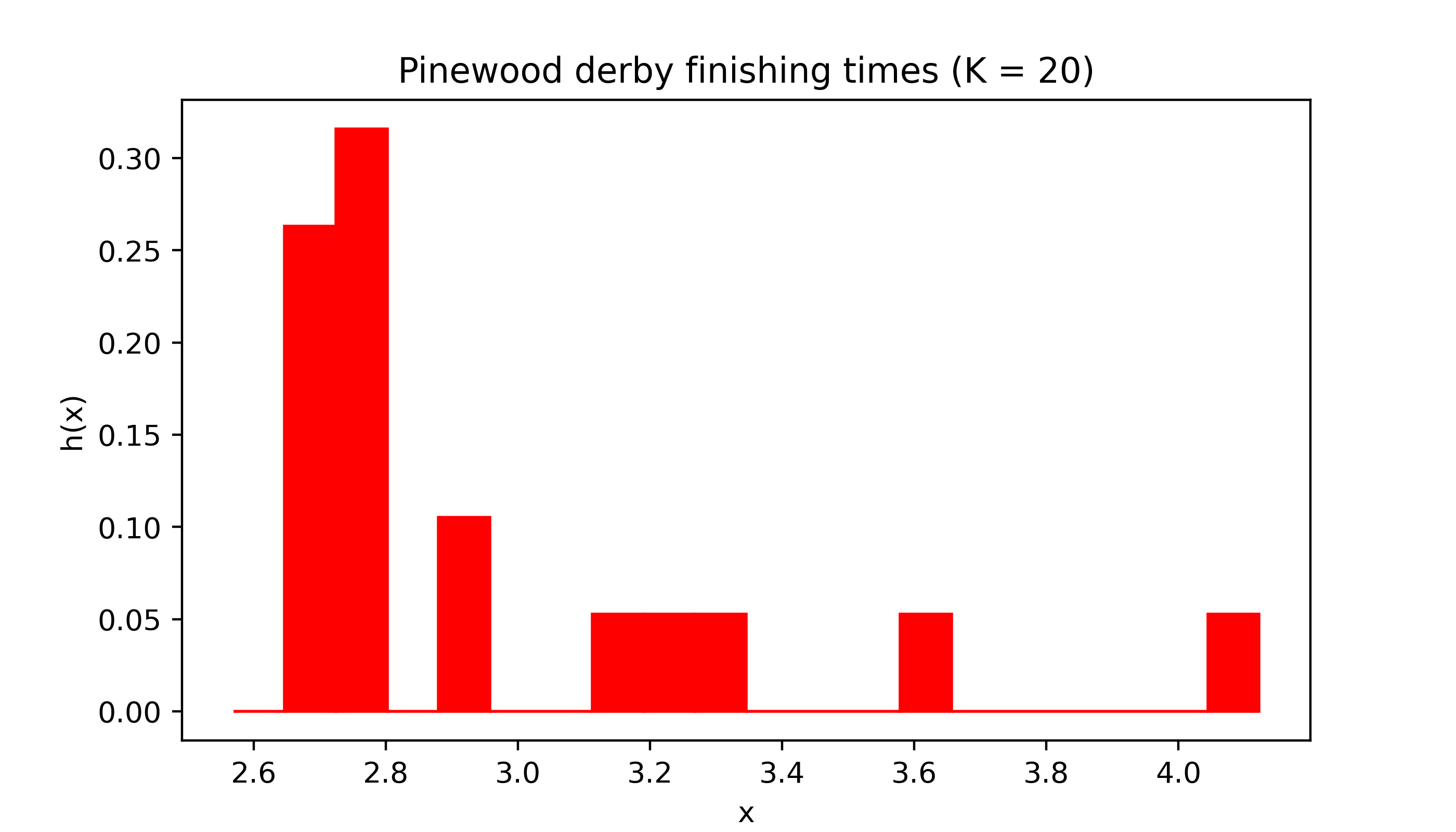
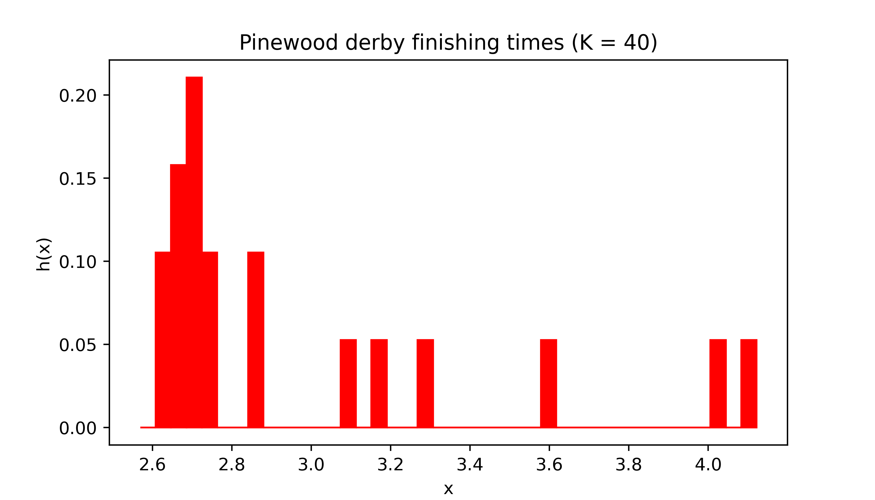
Changing the number of intervals or “bins” can have a dramatic effect on the appearance of the histogram.
Code
myhist(X,5,col,title='Pinewood derby finishing times (K = 5)')
Code
myhist(X,20,col,title='Pinewood derby finishing times (K = 20)')
Code
myhist(X,40,col,title='Pinewood derby finishing times (K = 40)')
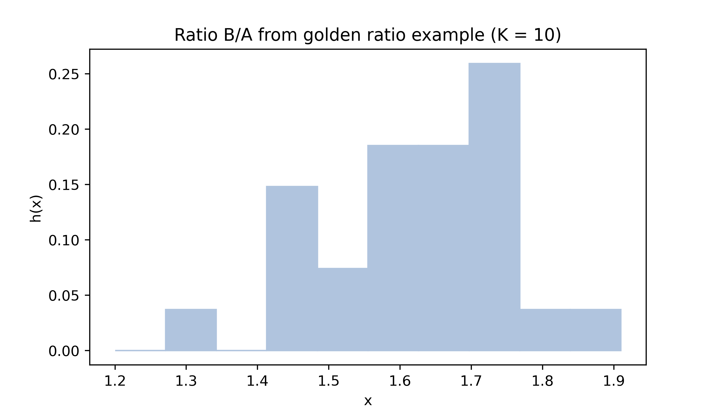
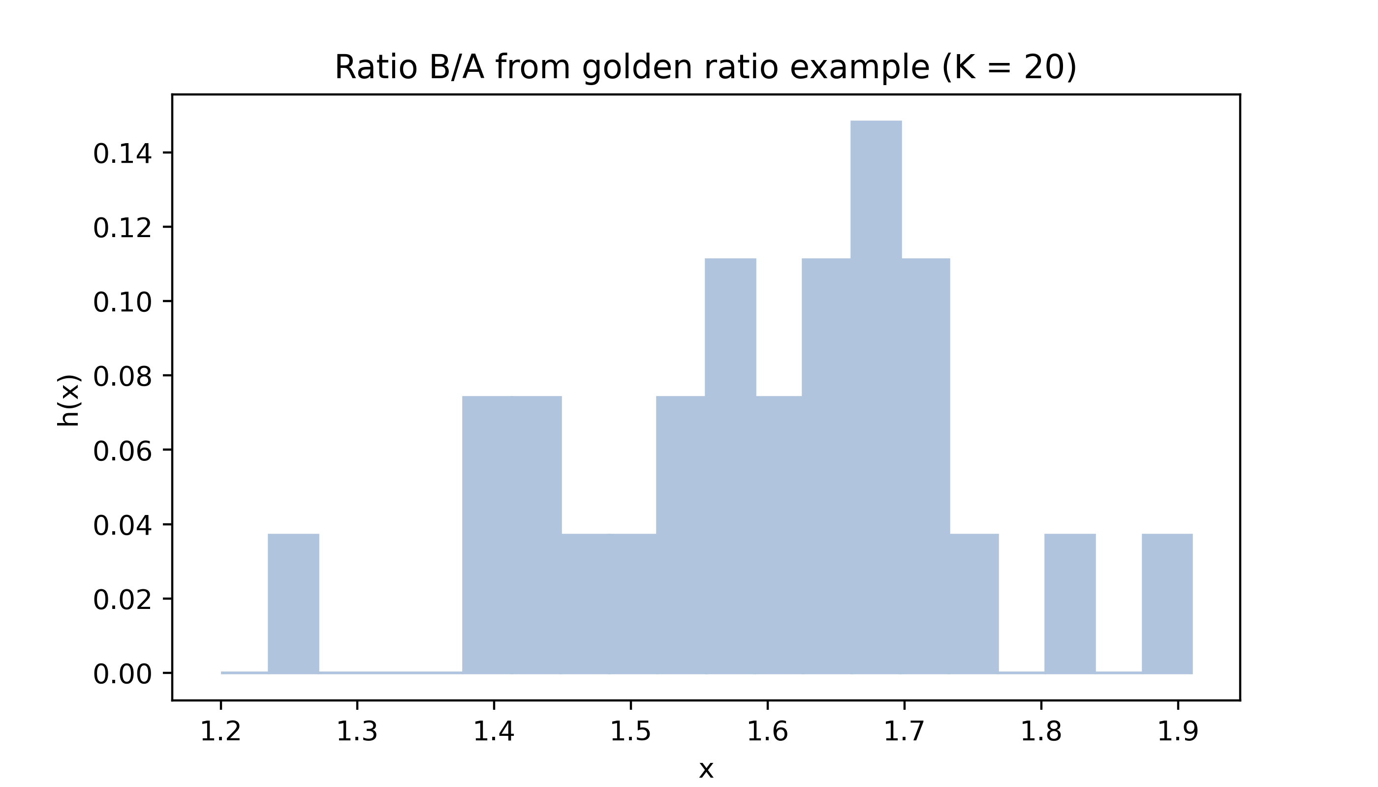
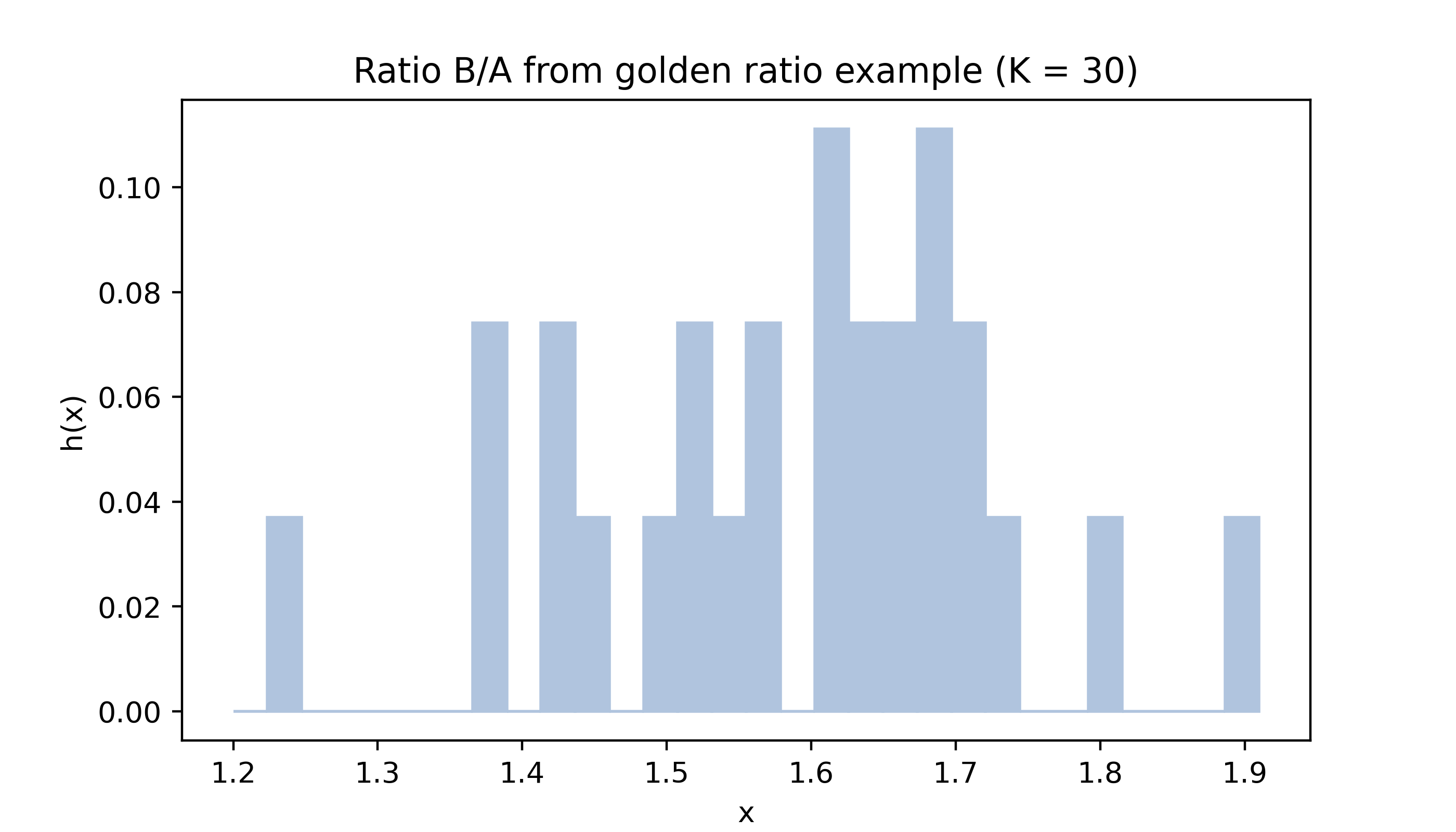
Below are histograms of the values in the golden ratio data from Example 15.2 with different numbers of bins.
Code
gr = np.array([1.66, 1.61, 1.62, 1.69, 1.58, 1.43, 1.66, 1.69, 1.58, 1.20, 1.52, 1.60, 1.55, 1.67, 1.77, 1.50, 1.64, 1.54, 1.40, 1.36, 1.50, 1.40, 1.35, 1.48, 1.64, 1.91, 1.70])col ='lightsteelblue'myhist(gr,10,col,title='Ratio B/A from golden ratio example (K = 10)')
Code
myhist(gr,20,col,title='Ratio B/A from golden ratio example (K = 20)')
Code
myhist(gr,30,col,title='Ratio B/A from golden ratio example (K = 30)')
The sample size \(n\) is quite small for both the pinewood derby finishing times (\(n = 19\)) and the golden ratio (\(n = 27\)) data, which makes the appearance of the histogram especially sensitive to the choice of the number of intervals \(K\).
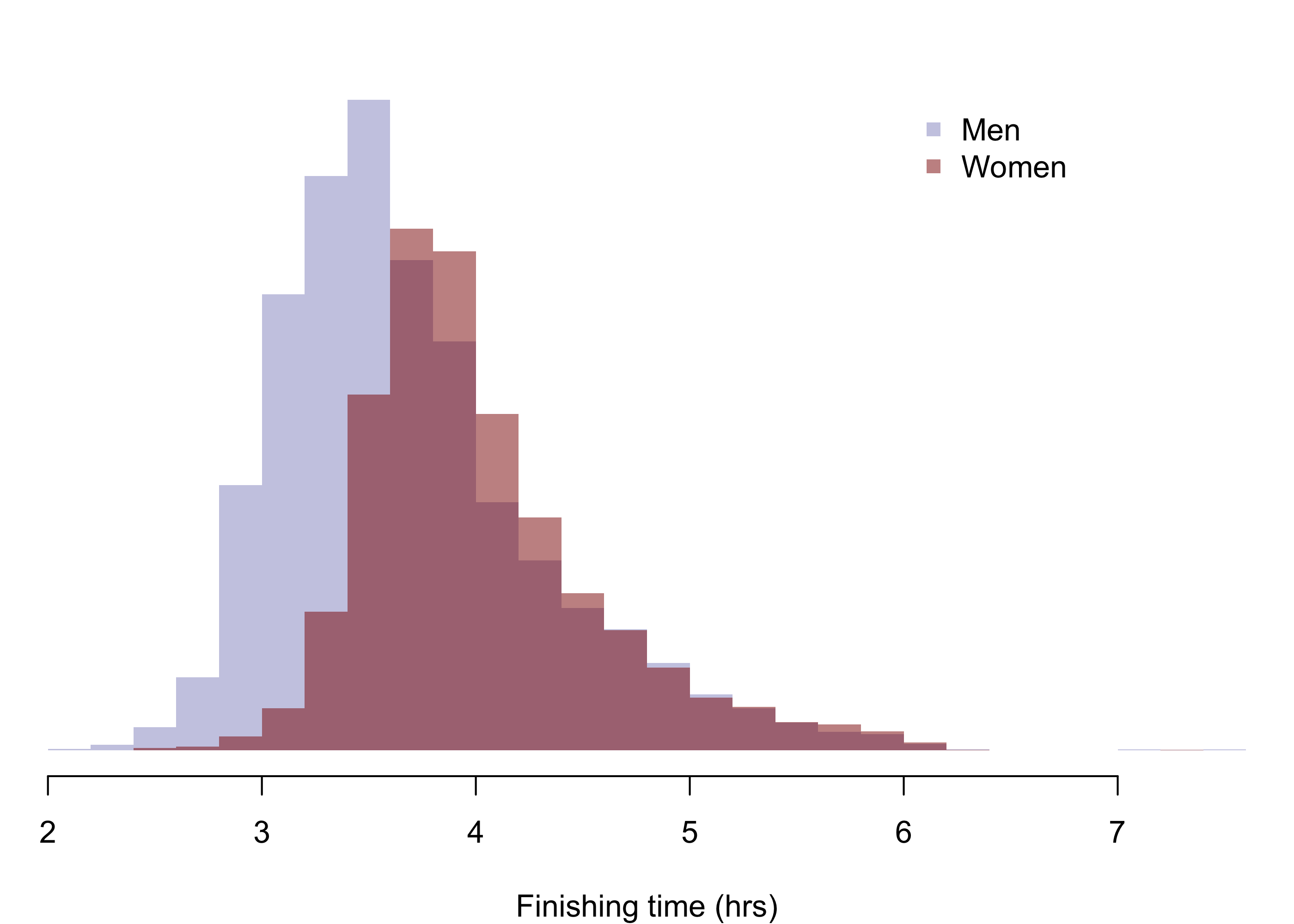
With a larger sample, the histogram can give a more accurate picture of the PDF of the population distribution; see the histograms in fig-boston09times of mens and womens finishing times in the 2009 Boston marathon.
Below are histograms of mens and womens finishing times of the 2009 Boston marathon. The mean and standard deviation of the finishing times of the \(13539\) men who completed the marathon were \(3.693\) and \(0.6276\), respectively; those of the \(9300\) women were \(4.021\) and \(0.5561\), respectively.
Code
par(mfrow =c(1,1), mar =c(4,0,2,0),bg =NA)hist(m,breaks =30,yaxt ="n",ylab ="",col =rgb(0,0,.545,.25),border =NA,main ="",xlab ="Finishing time (hrs)")xpos <-grconvertX(.7, from ="nfc", to ="user")ypos <-grconvertY(.9, from ="nfc", to ="user")legend(x = xpos, y = ypos,col =c(rgb(0,0,.545,.25),rgb(.545,0,0,.5)),pch =c(15,15),legend =c("Men","Women"),bty ="n",cex =1)hist(w,breaks =30,yaxt ="n",ylab ="",col =rgb(.545,0,0,.5),border =NA,add =TRUE)